List
The List component enables duplication of cards or rows with consistent structure, allowing for containment of other components. By default, editing or moving a component will apply changes to all cards or rows, while still allowing customization and exceptions for unique values per component.
To add a component to a list, you can either click on Insert while you select the container, or you can move an existing component by copy/pasting it.
Editing or moving a component will apply changes to all cards or rows.
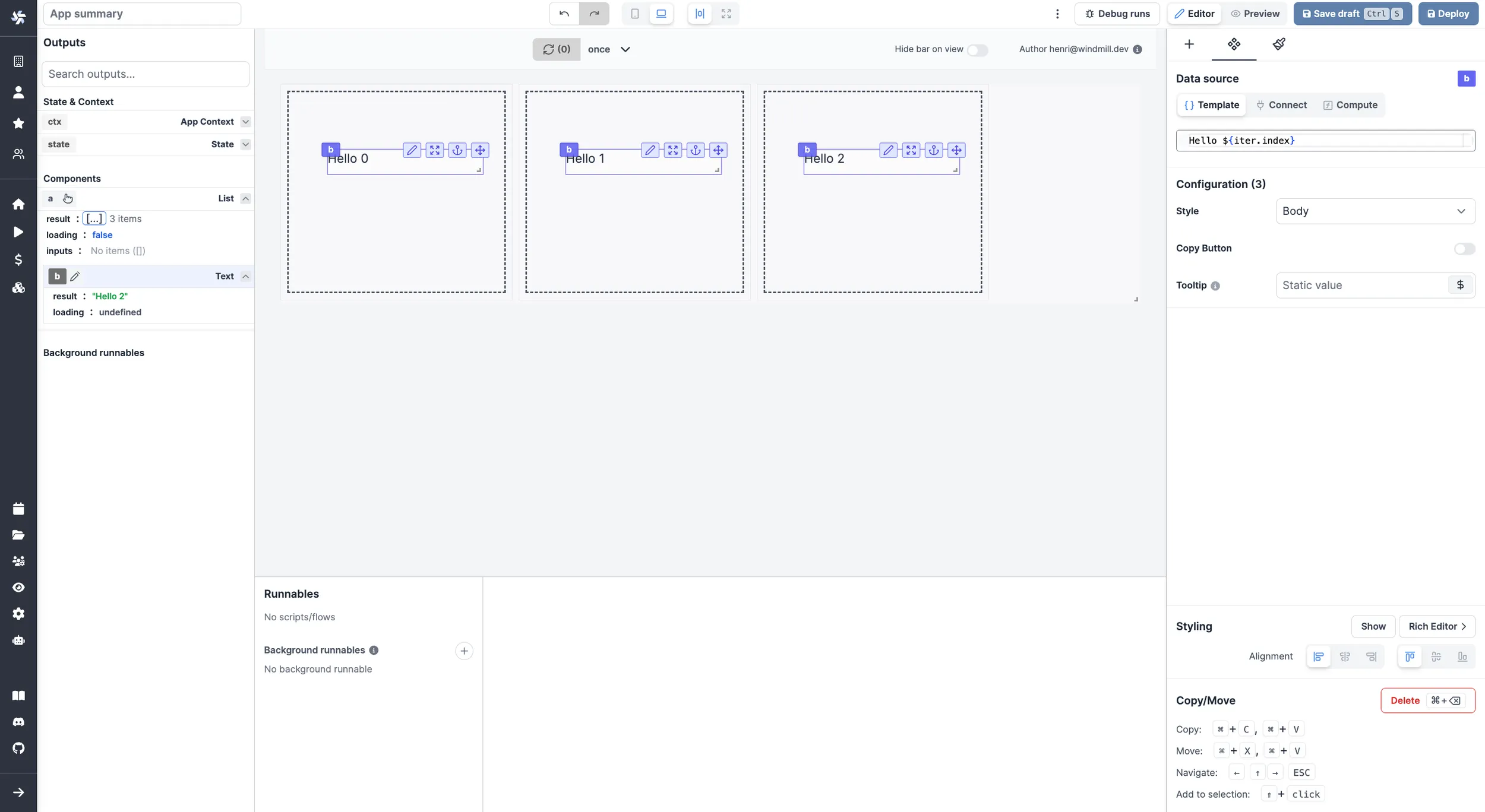
To customize the settings of components within each time, you can use iter.index and iter.value.
iter.indexwill retrieve the index number of each card (0, 1, 2 etc.).
iter.value.keywill retrieve the value of each key defined in theitemssection.
List components also support having inputs set inside them. Retrieve the values of each in the inputs field of the List component in the outputs menu.
The following section details List component's specific settings. For more details on the App editor, check the dedicated documentation or the App editor Quickstart:
Controls
This component can be controlled by frontend scripts using these functions:
recompute
Use the recompute function to recompute a component.
Syntax:
recompute(id: string)
Parameters:
id string
The id of the component to recompute.
Example:
recompute('a');
List configuration
| Name | Type | Connectable | Templatable | Default | Description |
|---|---|---|---|---|---|
| items | array | true | false | 3 items | The list items. |
| item keys | string | true | false | "foo": 1 ... | The keys of each card. |
| Width | string | false | false | "Card" | Whether items should be "Card" of "Full Row". |
| Min Width Px | number | true | true | 300 | The minimum width in pixels. Only applies when "Width" is set to Card |
| Height Px | number | true | true | 280 | The height in pixels. |
| Pagination | string | false | false | "Managed by runnable" | Pagination can be managed using two methods: By the component: Based on a specified page size, the component divides the array into several pages. By the runnable: The component shows all items, leaving the task of pagination to the runnable. The current page number is available in the component outputs. |
| Page count | number | false | false | 1 | The number of pages. Only applies when pagination is managed by the runnable. |
| Page size | number | false | false | 3 | The number of items per page. Only applies when pagination is managed by component. |
| Display borders | boolean | false | false | true | Whether to display borders around the list items. |
Outputs
| Name | Type | Description |
|---|---|---|
| result | any | The result of the list component. |
| loading | boolean | The loading state of the component. |
| inputs | any | The inputs of the component. |
| page | number | The current page number. |