Low-code app editor
The low-code app editor is a drag-and-drop builder to create custom User Interfaces with a mix of visual components and code. For building apps with React or Svelte, see Full-code apps.
If you're more into videos, you can check out our tutorial on the App editor:
The app editor is composed of 6 main sections:
Connecting components:
3. Outputs
4. Runnables panel

Toolbar
The topbar helps you in your app editing.
Learn more
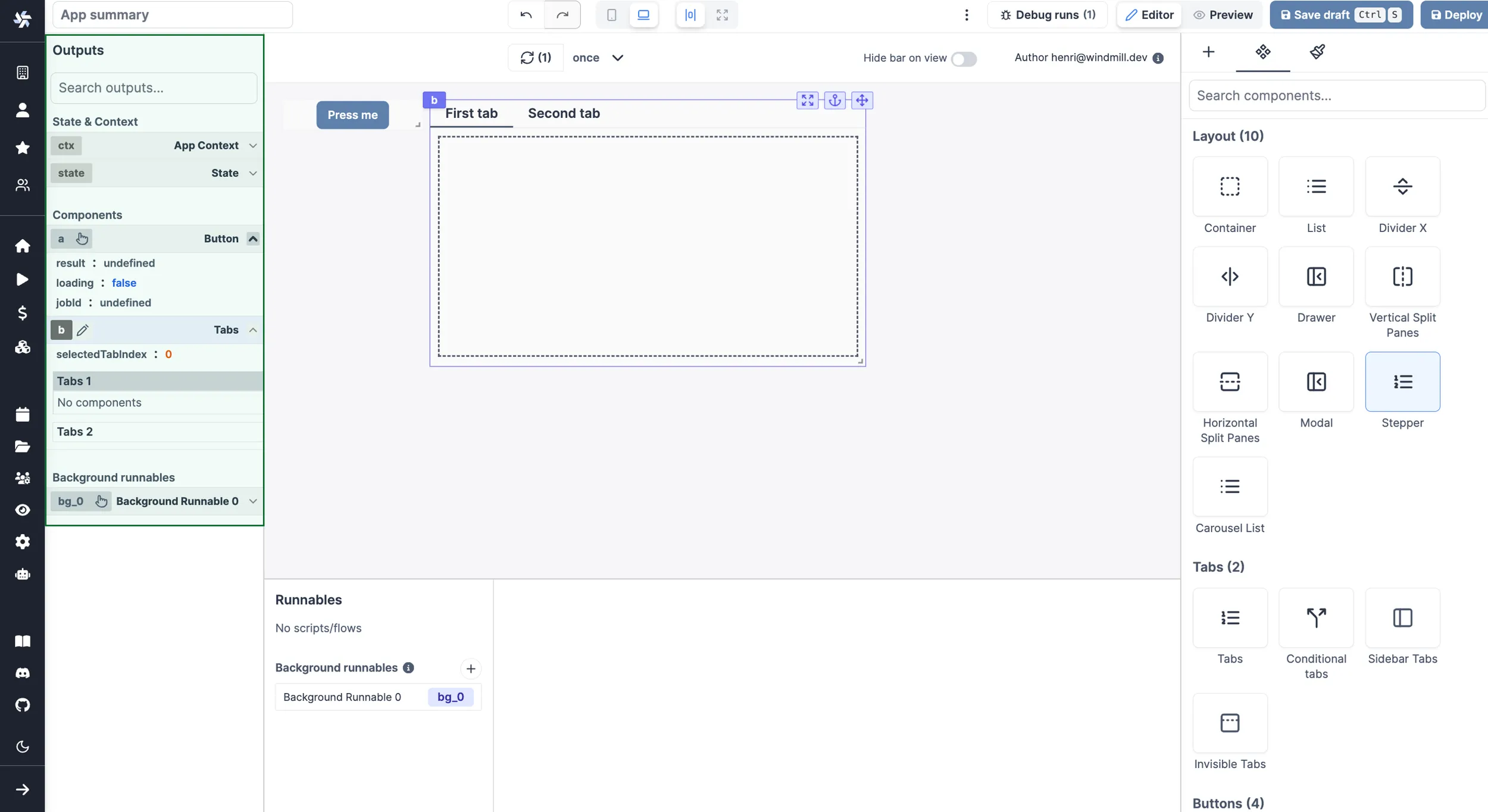
Canvas
The canvas at the center of the editor is where you design and see the overall UI. Insert new components, move them around, resize them, or nest them in containers.
Learn more
Connecting components
The strength of Windmill's app editor is the ability to connect everything together:
- components can be linked to each other
- components can be directly linked to scripts and trigger them
- background runnables can be that are run in the background on app refresh on when an input changes
- frontend scripts can be used to manipulate the client app state
In Windmill's app editor:
- the runnable editor catalogs and configures all the scripts present in the application
- the output panel lists the outputs of all the components and scripts in your application
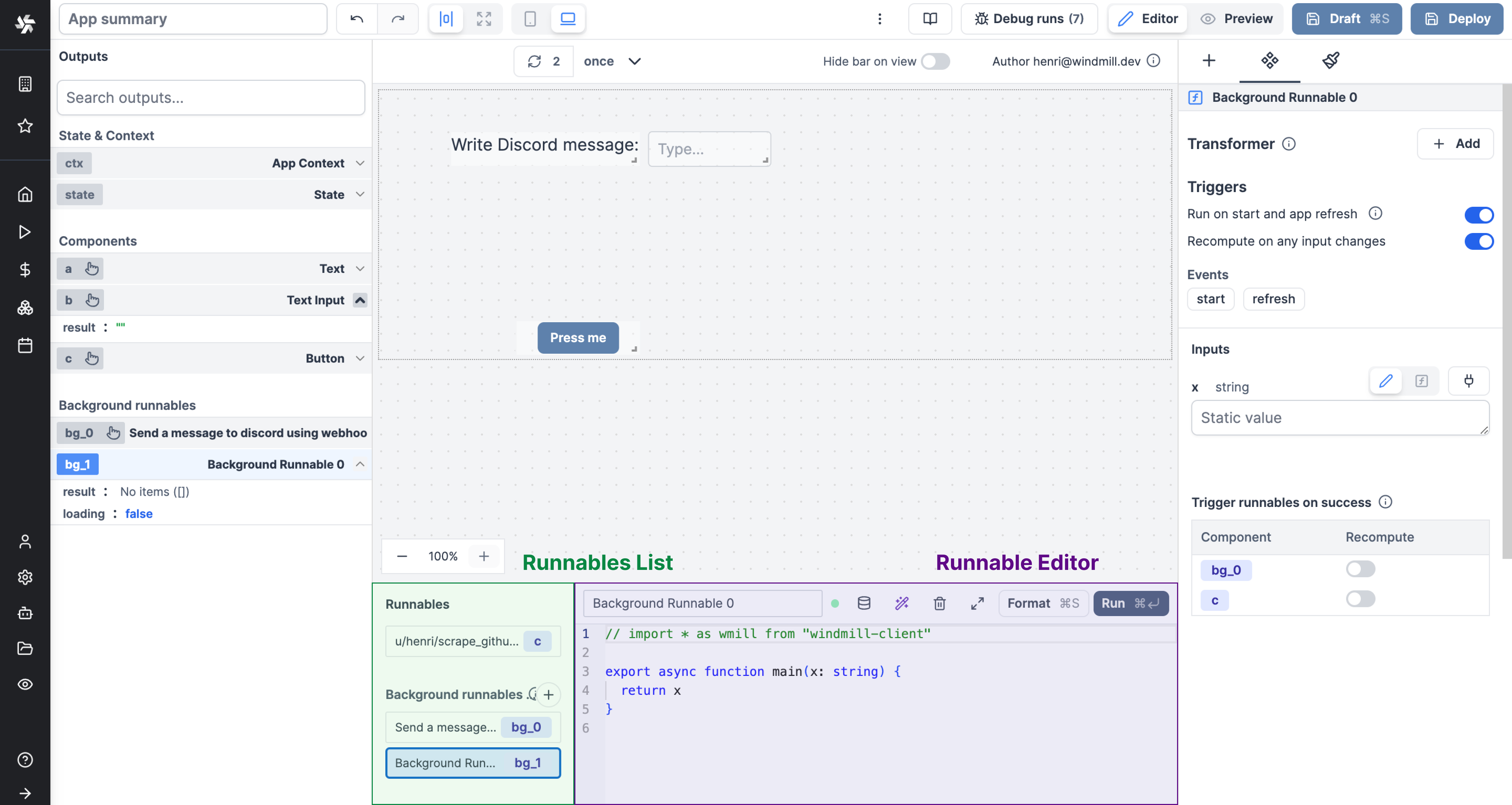
Runnables panel
On the bottom panel of the editor, you can see the list of runnables of the app. The runnables are the scripts or flows that are linked to components, or ran in the background. They are used to perform actions when a component is clicked, to fetch data, etc. They make all the interactions of the app.
Learn more
Outputs
On the left panel of the editor, you can see the list of outputs of the app. These outputs represent the states & results of the app and are categorized into four types:
- Context: The context holds information such as the user email, username, workspace, query parameters, and more.
- State: The state holds the app's current state, which can be manipulated by the frontend scripts.
- Component outputs: These outputs correspond to the outputs of the individual components.
- Background Runnables: These outputs represent the outputs of the background runnables.
You can perform the following actions with the outputs:
- Search for an output.
- Edit the output's ID.
- Select a component to view its outputs.
- Connect an input to an output.
Learn more
Component library and settings
Finally, on the right panel of the editor, you can insert a new component, configure a component or edit the component styles.


Learn more
Styling
Styling on the app editor can be managed at the component and app-level, with pre-set configurations or using CSS & Tailwind.