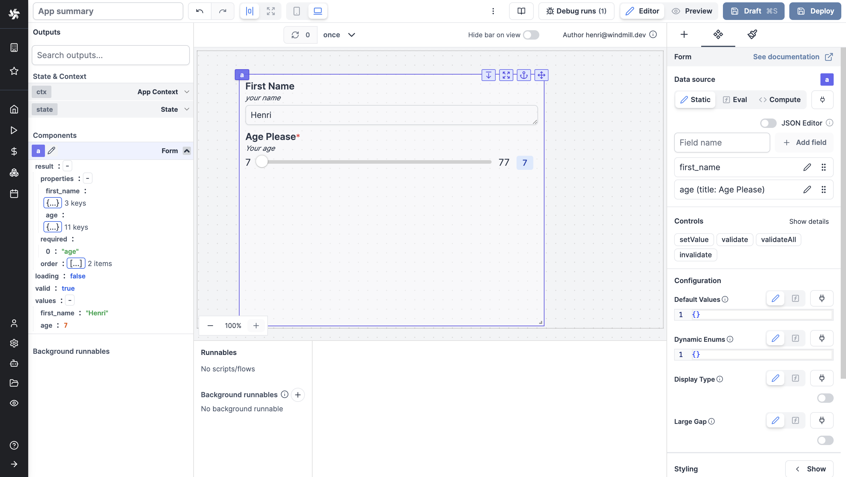
Form
The Form component allows you to create a form and get answers from the user.
The following section details Form component's specific settings. For more details on the App editor, check the dedicated documentation or the App editor Quickstart:
Data source
Fields are called property, they can be added as eval or connected to other components. They can be seen and filled as JSON.
Controls
This component can be controlled by frontend scripts using these functions:
setValue
The setValue function is meant to set or force the value of a component. This can be convenient in cases where connection is not the easiest pattern. Note that it's a bad idea to mix dynamic default value and setValue together.
setValue(id: string, value: any)
validate
Make a specific field of a form in a Validate state.
validate(id: string, key: string)
validateAll
Make all fields of a form in a Validate state.
validateAll(id: string, key: string)
invalidate
Invalidate a specific field of a form
invalidate(id: string, key: string, error: string)
Form configuration
| Name | Type | Connectable | Templatable | Default | Description |
|---|---|---|---|---|---|
| Display Type | boolean | true | false | false | This will display the type and/or the format on the field next to the label. |
| Large Gap | boolean | true | false | false | This will add a large gap between the field elements. |
| Default values | object | true | false | This enables setting default form values dynamically using an object: keys are field names, and values are the defaults. | |
| Default enums | object | true | false | This enables setting form enum values dynamically using an object: keys are field names, and values are arrays of strings. |
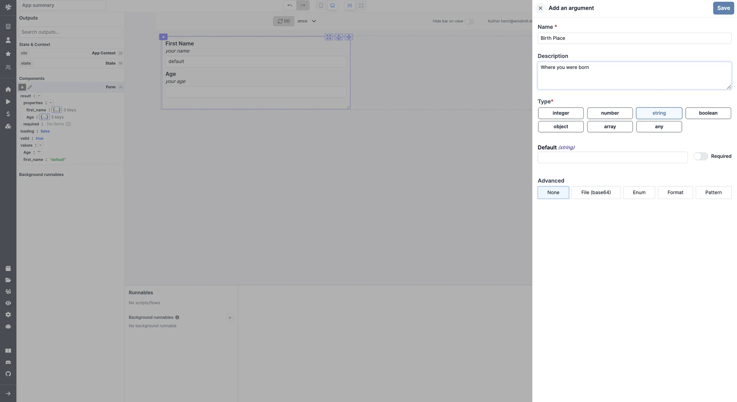
Each argument can be configured (name, description, type, default value, advanced parameters).
Outputs
| Name | Type | Description |
|---|---|---|
| properties | string | Type, description and default of each argument. |
| loading | boolean | The loading state of the text component. |
| valid | boolean | |
| values | same as each argument | Value of each answer by the user. |